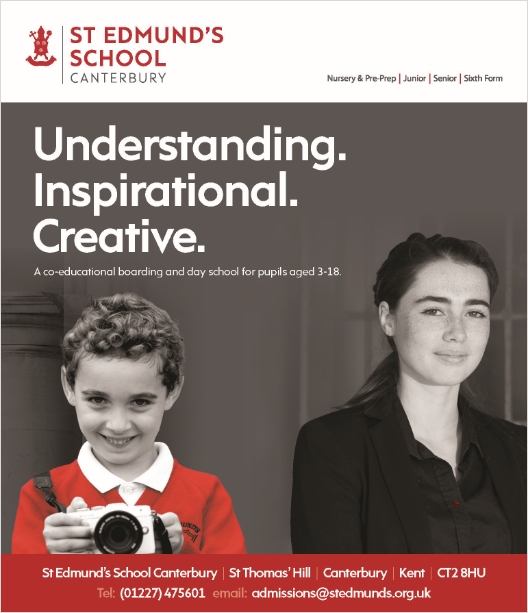
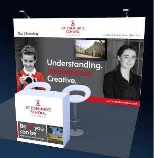
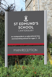
Raffertys work with a number of independent schools Including St Edmund’s in Canterbury.
We have been instrumental in working with them to refine the brand, update the logo and signage and create a suite of collateral for advertising and media.
We worked with the team there to refine the brand so that it retained its rich history and strong position within the Independent schools market.
However we wanted to bring some modernity through colours and typeface messaging and photography. The colour palette was updated with an introduction of jade green to complement the red, and the typeface refined along with the crest.This was rolled out across all signage etc.
The outcome is that the brand is…
…much more appealing, accessible and modern and reflects the approachable, friendly nature of the school.

Sussex-based Creative Agency.
Call: +44 07552878381 Email: hilary@raffertys.co.uk